
Finding clarity in endless spreadsheets is a daily challenge for busy e-commerce managers. When every decision depends on rapidly shifting sales data and complex customer interactions, clear visual analytics become more than tools—they are lifelines. By transforming raw data into vivid charts and dashboards, managers can unlock actionable insights behind product bundling and retention efforts, making it possible to see patterns that were hidden in numbers alone. Bold data visualization directly supports smarter, faster decision-making.
Table of Contents
- Defining Data Visualization in Ecommerce Context
- Key Visualization Types for Online Retailers
- How Data Visualization Enhances Decision-Making
- Real-World Use Cases: Bundling and Retention
- Avoiding Common Data Visualization Mistakes
Key Takeaways
| Point | Details |
|---|---|
| Importance of Data Visualization | Data visualization simplifies complex ecommerce data, enhancing decision-making through clear graphical representations. |
| Choosing Effective Visualization Types | Selecting the right visualization tools for specific business questions can lead to more actionable insights and quicker understanding. |
| Avoiding Common Pitfalls | Simplifying graphics and ensuring appropriate chart choices helps in preventing misconceptions and enhances data interpretation. |
| Leveraging Customer Insights | Analyzing visual data enables understanding of customer behaviors, improving strategies for product bundling and retention. |
Defining Data Visualization in Ecommerce Context
Data visualization in ecommerce represents the strategic transformation of complex transaction and customer interaction data into meaningful, intuitive graphical representations. By converting raw numbers into charts, graphs, and interactive dashboards, online retailers can quickly decode patterns, trends, and insights that drive smarter business decisions.
Modern ecommerce data visualization goes far beyond simple bar graphs. Business decision-makers utilize visual analytics to translate intricate datasets into comprehensible formats that reveal critical consumer behaviors and purchasing patterns. These visual tools help teams understand:
- Customer segmentation dynamics
- Product performance trends
- Conversion rate fluctuations
- Geographic purchase distributions
- Seasonal buying patterns
The core purpose of data visualization is translating complexity into clarity. Visual analytics enable ecommerce managers to rapidly interpret massive datasets without getting lost in spreadsheet minutiae. Interactive visual interfaces help manage large online product catalogs by presenting information in digestible, actionable formats.
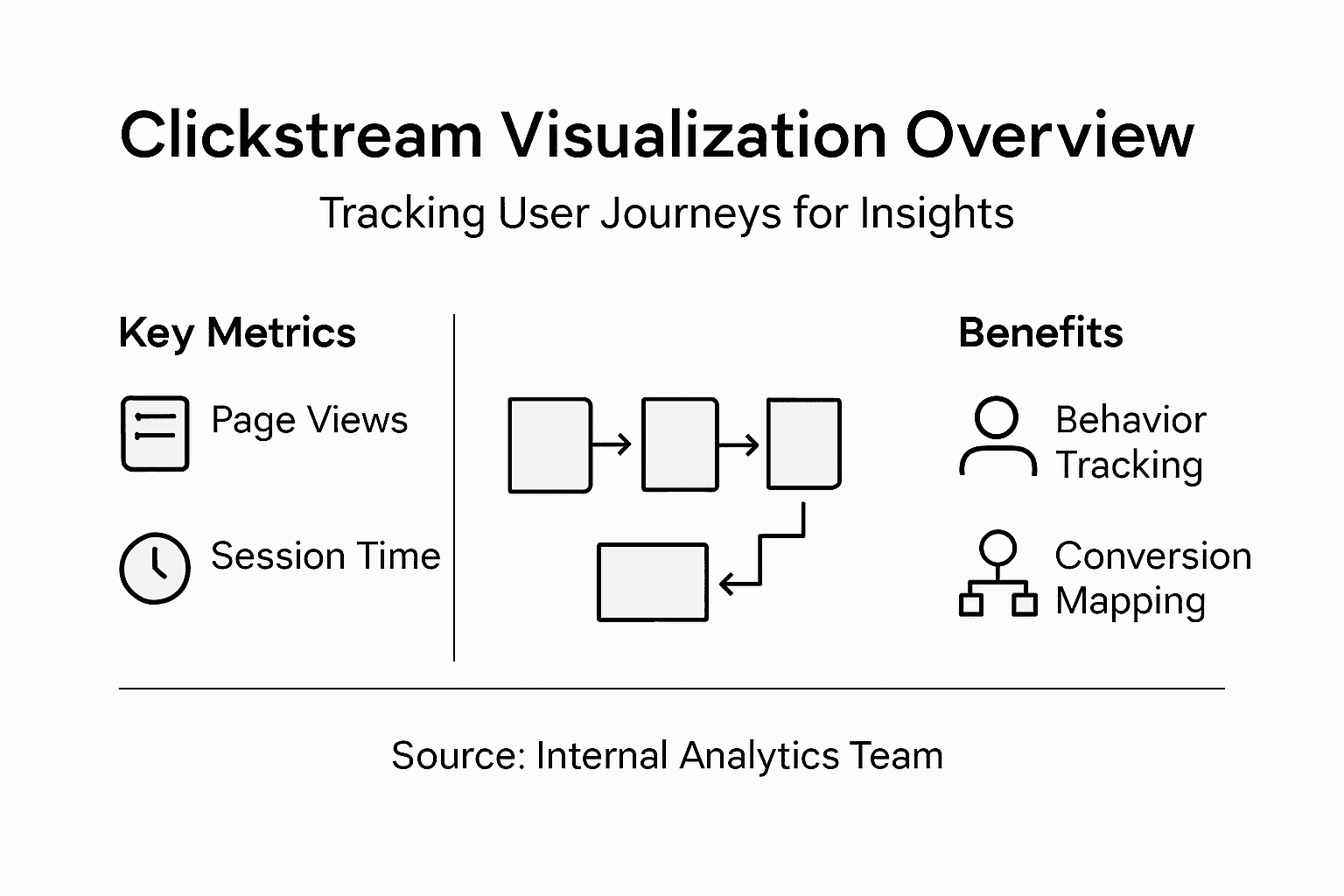
Clickstream analysis represents a powerful application of data visualization techniques. By mapping user journeys through website interactions, businesses can understand precisely how customers navigate product selections, what triggers purchases, and where potential friction points exist in the shopping experience.
Pro tip: Start with simple, clear visualizations that highlight 2-3 critical metrics before building complex dashboards to avoid overwhelming your team with excessive information.
Key Visualization Types for Online Retailers
Online retailers leverage multiple data visualization techniques to transform complex transaction information into actionable strategic insights. Descriptive analytics enable comprehensive visual representations that help businesses understand critical performance metrics across multiple dimensions.
The most powerful visualization types for ecommerce include:
- Sales Trend Charts: Line graphs tracking revenue performance
- Customer Segmentation Heatmaps: Visual representations of demographic purchasing behaviors
- Conversion Funnel Diagrams: Graphical display of customer journey stages
- Geographic Distribution Maps: Visualizing sales across different regions
- Product Performance Dashboards: Interactive displays showing inventory and sales metrics
Interactive visualization tools have revolutionized how online retailers analyze data. Advanced visualization platforms support scientific decision-making by converting raw transactional data into intuitive, actionable graphics. These tools enable managers to quickly identify patterns, understand customer behaviors, and make strategic adjustments in real-time.

Specialized charts like scatter plots, bubble graphs, and network diagrams provide nuanced insights into complex relationships between products, customer segments, and purchasing behaviors. By transforming numerical data into visual narratives, these graphics help teams communicate complicated insights quickly and effectively.
Pro tip: Choose visualization types that match your specific business question, ensuring the graphic format directly answers the strategic insight you’re seeking.
Here’s a comparison of common ecommerce data visualization tools and their key strengths:
| Visualization Tool Type | Main Business Value | Ideal Use Case |
|---|---|---|
| Interactive Dashboards | Real-time monitoring, unified view | Sales performance tracking |
| Heat Maps | Quick anomaly detection, clarity | Understanding customer segmentation |
| Conversion Funnel Diagrams | Identifies drop-off points, improves flow | Optimizing checkout process |
| Geographic Distribution Maps | Reveals market hotspots, guides expansion | Regional sales strategy |
How Data Visualization Enhances Decision-Making
Innovative data visualization techniques dramatically transform business decision-making processes by converting complex datasets into clear, actionable insights. By translating raw numbers into meaningful visual representations, businesses can accelerate their strategic understanding and reduce potential misinterpretation risks.
The key advantages of data visualization in decision-making include:
- Faster pattern recognition
- Reduced cognitive load
- Improved communication of complex insights
- Enhanced strategic planning capabilities
- Quicker identification of potential opportunities
Decision-making acceleration occurs through several critical mechanisms. Business insights become more comprehensible through visual transformation, enabling managers to process information more rapidly and with greater accuracy. Visual representations eliminate the need for extensive numerical analysis, allowing leaders to grasp critical trends and anomalies at a glance.
Complex data relationships that might remain hidden in traditional spreadsheets emerge clearly through sophisticated visualization techniques. Scatter plots, network diagrams, and heat maps can reveal nuanced connections between variables, helping decision-makers understand underlying patterns that would be impossible to detect through raw numerical analysis.
Pro tip: Select visualization tools that match your specific analytical needs, prioritizing clarity and immediate comprehension over technical complexity.
Real-World Use Cases: Bundling and Retention
Data visualization transforms product bundling strategies by revealing intricate connections between customer preferences and purchasing behaviors. By converting complex transaction data into intuitive visual representations, ecommerce businesses can develop more targeted and effective product combinations that drive higher sales and customer satisfaction.
Successful data visualization approaches for bundling and retention include:
- Analyzing cross-purchase patterns
- Identifying complementary product relationships
- Tracking customer segment purchasing behaviors
- Monitoring retention rates for bundled offerings
- Predicting potential churn risks
Customer sentiment analysis provides critical insights into product bundling effectiveness. Interactive dashboards support operational decision-making by revealing nuanced relationships between product performance and customer engagement. These visual tools help businesses understand which bundle configurations most effectively drive repeat purchases and long-term customer loyalty.
Real-world implementation involves using advanced visualization techniques like heat maps, network diagrams, and interactive charts to decode complex purchasing patterns. By translating raw transactional data into comprehensible visual narratives, businesses can identify subtle correlations that traditional numerical analysis might overlook, ultimately creating more compelling product packages.
Pro tip: Continuously experiment with bundle configurations by using data visualization insights, treating each visualization as a learning opportunity to refine your product strategy.
Avoiding Common Data Visualization Mistakes
Data visualization errors can critically undermine business decision-making by presenting misleading or confusing information. Recognizing and preventing these common pitfalls is essential for creating clear, actionable visual representations that drive strategic insights.
Common data visualization mistakes in ecommerce include:
- Overcrowding graphics with excessive information
- Selecting inappropriate chart types
- Ignoring audience comprehension levels
- Using misleading color schemes
- Neglecting data context and nuance
- Failing to highlight key insights
Visual complexity often undermines data communication. Cluttered graphics compromise analytical effectiveness by overwhelming viewers and obscuring critical patterns. Successful visualizations simplify complex information, making insights immediately accessible and actionable.
Ecommerce managers must carefully balance detail and clarity. Effective visualizations require strategic design choices that prioritize meaningful insights over decorative complexity. This means selecting chart types that naturally communicate the underlying data story, using color and formatting to guide viewer attention, and ensuring that each visual element serves a specific analytical purpose.
Below is a summary of common data visualization pitfalls and how to prevent them:
| Mistake Type | Typical Impact | Prevention Strategy |
|---|---|---|
| Overcrowded Graphics | Confuses viewers, hides insights | Show only key metrics in each chart |
| Poor Chart Selection | Misleads interpretation | Choose chart suited for data relationships |
| Misleading Colors | Causes incorrect assumption | Use intuitive, consistent color schemes |
| Ignoring Data Context | Fails to communicate significance | Always explain key assumptions |
Pro tip: Always ask a colleague who is unfamiliar with the data to interpret your visualization - if they struggle to understand the key insights, your design needs refinement.
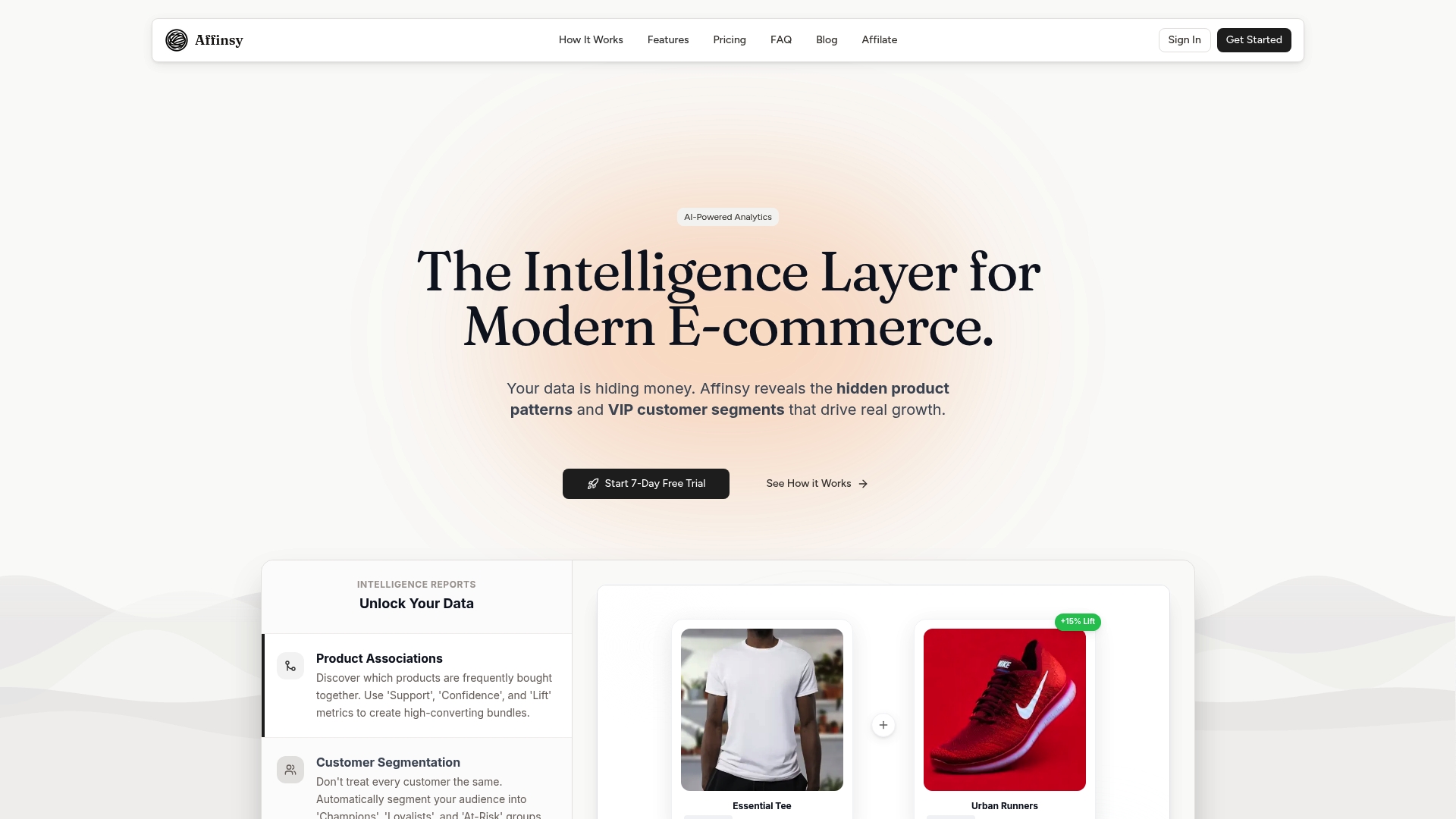
Unlock the Full Power of Ecommerce Data Visualization with Affinsy
The challenge of transforming complex transaction data into clear, actionable insights is at the heart of smarter ecommerce decision-making. This article reveals how data visualization techniques such as market basket analysis and customer segmentation drive higher sales and improve retention. If you are struggling to decode hidden product relationships or optimize your bundling strategies, your ecommerce business deserves a platform that makes data-driven decisions simple and effective.
Affinsy is designed precisely for this need. Leveraging AI-powered analytics, Affinsy transforms your historical sales and customer data into intuitive dashboards focused on product associations and RFM customer segments. Easily integrated with Shopify, WooCommerce, and Google Analytics, it empowers store owners and marketing managers to increase average order value and customer loyalty without requiring deep data science skills.
Boost your ecommerce growth today with Affinsy.
Discover how to turn complex ecommerce data into compelling visual insights by visiting Affinsy. Explore features like custom report generation and advanced dashboards that bring clarity to your sales trends and customer behaviors. Don’t wait to unlock smarter product bundling and retention strategies that drive real results. Start your journey at Affinsy now.
Frequently Asked Questions
What is data visualization in ecommerce?
Data visualization in ecommerce is the process of transforming complex transaction and customer interaction data into intuitive graphical representations like charts and dashboards, enabling retailers to quickly identify patterns and insights that inform business decisions.
How can data visualization improve sales performance?
Data visualization can improve sales performance by helping ecommerce managers quickly decode customer behaviors and product performance trends, allowing for informed strategic adjustments that can enhance conversion rates and customer satisfaction.
What types of data visualizations are most effective for online retailers?
Effective data visualizations for online retailers include sales trend charts, customer segmentation heatmaps, conversion funnel diagrams, geographic distribution maps, and product performance dashboards, each serving specific analytical needs and providing actionable insights.
What common mistakes should be avoided when creating data visualizations?
Common mistakes include overcrowding graphics with excessive information, selecting inappropriate chart types, using misleading color schemes, and failing to highlight key insights. Simplifying visuals and focusing on clarity are essential for effective communication.
Recommended
- Ecommerce Data Visualization for Sales Growth - Affinsy Blog | Affinsy
- 7 Essential Data Visualization Best Practices for 2025 - Affinsy Blog | Affinsy
- Sales Data Analysis: Unlocking E-Commerce Growth - Affinsy Blog | Affinsy
- Why Ecommerce Analytics Matter for Online Retailers - Affinsy Blog | Affinsy