
TL;DR:
- Actionable sales reports link metrics directly to business decisions and include segmentation with clear interpretation.
- High-quality, clean transaction data is essential for meaningful insights, requiring thorough preparation and categorization.
- Structuring reports around specific questions and visualizing KPIs with interpretation sections drives informed decision-making.
You have months of transaction data sitting in your dashboard, yet your next marketing decision still feels like a guess. That gap between data and action is where most e-commerce growth stalls. Actionable sales reports close that gap by translating raw numbers into decisions you can execute today. This guide walks you through every step: defining what makes a report truly actionable, preparing your data correctly, structuring reports for clarity, and turning findings into strategies that move revenue. Whether you run a Shopify store or manage a multi-channel brand, the framework here will make your sales data work harder for you.
Table of Contents
- Understand what makes a sales report actionable
- Prepare your transaction data for useful insights
- Structure your sales report for decision-making
- Interpret and act on sales report insights
- Why most sales reports miss the mark—and how to do better
- Take the next step: Power up your sales insights
- Frequently asked questions
Key Takeaways
| Point | Details |
|---|---|
| Focus on actionable insights | Design sales reports to answer business-critical questions, not just display data. |
| Segment your data | Break down sales by customer type, geography, and product to uncover hidden growth opportunities. |
| Connect data to action | Use findings from sales reports to inform concrete strategies such as pricing, promotions, and regional expansion. |
| Watch for risks | Beware of market over-reliance or seasonal shifts when interpreting trends in your reports. |
Understand what makes a sales report actionable
Most sales reports answer one question: what happened? Actionable reports answer a harder question: what should we do next? That shift in framing changes everything about how you build and read a report.
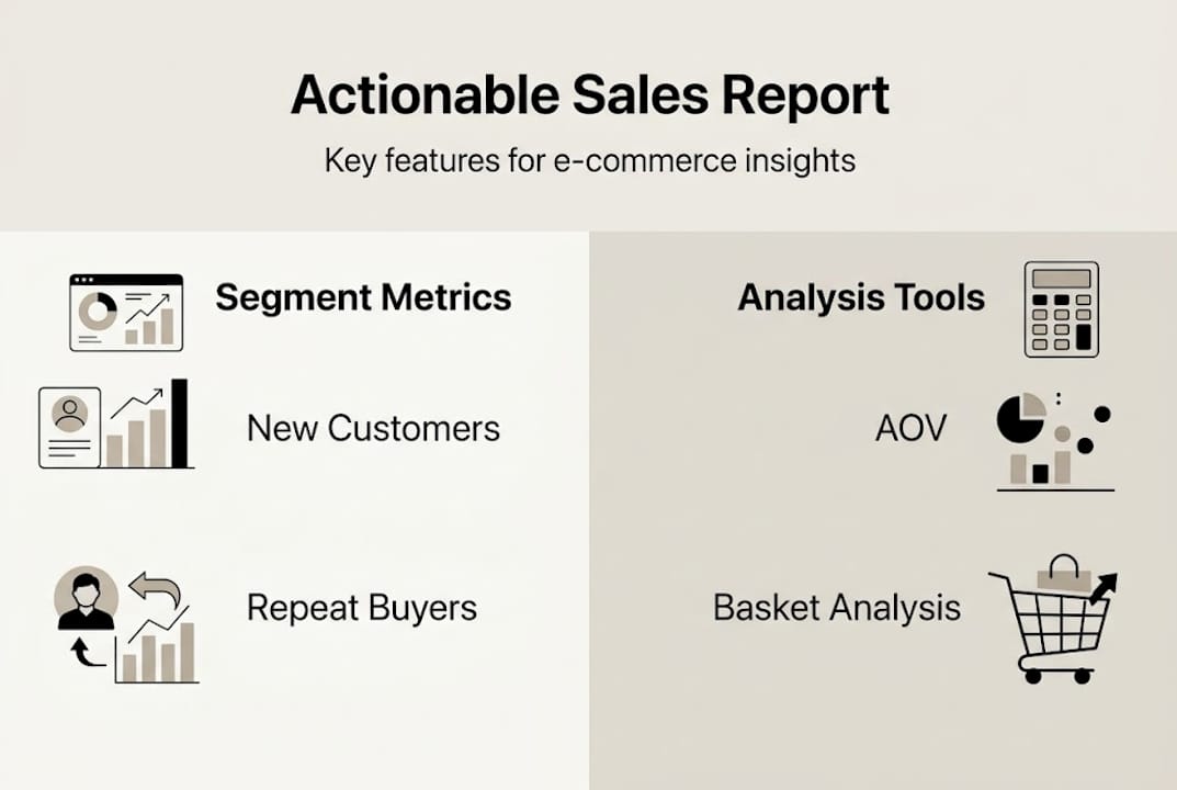
An actionable report has three defining features. First, it ties every metric to a business decision. Second, it segments data in ways that reveal meaningful differences, not just averages. Third, it includes a clear interpretation layer so the reader knows what the numbers mean in context. Without those three elements, you have documentation, not direction.
The difference becomes obvious when you compare report formats side by side:
| Traditional report | Actionable report |
|---|---|
| Total revenue this month | Revenue by new vs. repeat customers |
| Units sold | Top 10 products by margin, not just volume |
| Traffic by channel | Conversion rate by channel and segment |
| Geographic sales totals | High-AOV regions vs. low-margin regions |
| Year-over-year growth | Repeat purchase rate trend with CRM action flag |
The right-hand column forces a response. The left-hand column just files a record.
Key performance indicators that belong in every actionable e-commerce report include:
- Average order value (AOV): Signals bundling and upsell opportunity
- Conversion rate by segment: Reveals where marketing spend is efficient
- Repeat purchase rate: Tracks loyalty and CRM effectiveness
- Top and bottom products by margin: Separates volume winners from profit winners
- Geographic revenue share: Shows concentration risk and expansion potential
- Basket contents: Exposes natural product affinities for cross-sell
“The best sales reports don’t just tell you what sold. They tell you who bought it, where they are, and what else they’re likely to want.”
Learning to leverage transaction data for customer insights is the foundation of this entire approach. If you want a deeper look at the anatomy of a strong report, the sales analysis report insights breakdown is a solid reference. For a broader view of how reporting fits into growth strategy, the ecommerce reporting guide covers the full picture.
Prepare your transaction data for useful insights
The quality of your report is a direct reflection of the quality of your data. Garbage in, garbage out is a cliche because it’s true. Before you build a single chart, your transaction data needs to be clean, complete, and structured for segmentation.

Start with data hygiene. Remove duplicate orders, fix inconsistent product naming (“Blue T-Shirt” and “blue tshirt” are the same product, but your system may not know that), and flag or exclude test transactions. Even a small percentage of dirty records can skew repeat purchase rates and AOV calculations enough to send you in the wrong direction.
Next, make sure your dataset includes the right fields. Here’s a practical reference:
| Field | Why it matters |
|---|---|
| Order date and time | Enables trend analysis and seasonality detection |
| Customer ID | Distinguishes new vs. repeat buyers |
| Product SKU and name | Supports product-level and basket analysis |
| Region or postal code | Powers geographic segmentation |
| Sale value | Core revenue metric |
| Margin or cost | Separates volume from profitability |
| Basket contents | Enables cross-sell and bundle insights |
Once your fields are confirmed, follow this preparation sequence:
- Export raw transaction data from your platform (Shopify, WooCommerce, BigCommerce, or any system that outputs order history)
- Remove duplicates and correct naming inconsistencies
- Categorize customers as new or repeat based on order history
- Tag orders by region, product group, and sales channel
- Calculate derived fields: AOV, margin per order, basket size
- Load the cleaned dataset into your reporting or analytics tool
Pro Tip: Always keep an unaltered copy of your raw export before cleaning. If a finding looks surprising later, you’ll want to audit back to the source without guessing what changed.
Segmenting by new and repeat customers, AOV, geographic revenue, and basket analysis is what separates useful data from a spreadsheet of noise. The workflow for ecommerce insights article shows how to operationalize this prep step, and sales data analysis tips covers common mistakes to avoid during the cleaning phase.
Structure your sales report for decision-making
With clean, segmented data ready, the next challenge is designing a report that actually gets used. A report that confuses its reader gets ignored. Structure is what makes insights stick.
Always start with the business question, not the data. Ask: what decision does this report need to support? Inventory reorder? A campaign targeting lapsed customers? A pricing review for low-margin products? The answer shapes which KPIs lead the report and how you visualize them.
Here’s a step-by-step process for building a decision-ready report:
- Define the core question the report must answer
- Select 4 to 6 KPIs that directly address that question
- Segment the data by customer type, region, product group, and time period
- Choose the right visualization for each metric
- Add an interpretation layer: one to two sentences per chart explaining what the trend means
- Include a “next actions” section at the end that lists 2 to 3 specific decisions the data supports
Visualization choices matter more than most people realize. Use the right format for the story:
- Bar charts: Compare product or regional performance at a point in time
- Line charts: Show trends over time, like AOV or repeat rate month over month
- Geographic heatmaps: Reveal revenue concentration and underserved markets
- Cohort charts: Track customer retention by acquisition period
- Scatter plots: Identify outliers in margin vs. volume relationships
Pro Tip: Use color intentionally. Highlight cells or bars that show dramatic shifts from the prior period in a contrasting color. Your reader’s eye will go there first, which is exactly where you want their attention.
Keep the layout clean. A summary table at the top with your top-line KPIs, followed by segmented detail sections, followed by the actions section is a format that works for both weekly operational reviews and monthly strategic sessions. Reports built for actionable analytics use this structure consistently. For product-level decisions, integrating basket analysis into the report adds a layer of cross-sell intelligence that flat revenue tables simply can’t provide.
Using reports for pricing and inventory optimization, cross-sell targeting, and expansion into high-revenue regions is where the structure pays off.
Interpret and act on sales report insights
Building the report is the easy part. The harder skill is reading it critically and connecting findings to specific actions. This is where most teams leave value on the table.
Tie every KPI movement to a potential cause and a potential response. Rising repeat purchase rate? That’s a signal to invest more in your CRM and loyalty program. Falling AOV in your top region? Look at whether a discount campaign is training customers to wait for deals. Flat conversion rate despite growing traffic? The acquisition channel may be pulling in low-intent visitors.
Here are common findings and the actions they should trigger:
- High AOV in one region, low in others: Launch region-specific bundles or minimum-order promotions in underperforming markets
- Fast-moving products with thin margins: Review pricing, supplier costs, or consider bundling with high-margin items
- High new customer volume, low repeat rate: Prioritize post-purchase email sequences and loyalty incentives
- Strong basket overlap between two products: Create a formal bundle and test it as a promoted offer
- Revenue concentrated in one product category: Diversify promotional spend to reduce single-category dependence
“An outlier in your data is a hypothesis, not a conclusion. Before you act on a spike or a drop, check whether it reflects a real trend or a data artifact like a bulk order or a refund batch.”
Geo concentration creates over-reliance on one market, and high seasonality requires careful period selection when comparing performance. Both are risks that show up clearly in well-structured reports but get missed when teams only look at totals.
For product bundling and cross-sell decisions, smarter bundling using basket data is one of the fastest ways to lift AOV without increasing ad spend. If you want a framework specifically for that, AOV market basket analysis walks through the mechanics in detail.
Why most sales reports miss the mark—and how to do better
Here’s an uncomfortable truth: the majority of e-commerce sales reports are built to reassure, not to challenge. Teams track revenue because it usually goes up. They report on traffic because it looks like progress. They avoid metrics that surface uncomfortable questions, like whether their best-selling product is actually profitable after returns and fulfillment costs.
The most common failure mode is reporting vanity metrics without context. A 20% revenue increase sounds great until you realize it came from a single bulk order in a market you can’t reliably serve. Seasonality and market concentration are two factors that consistently get ignored, and both can make a healthy-looking report hide a fragile business.
The discipline that separates exceptional reporting from average reporting is the “so what?” test. After every finding, ask it out loud. If you can’t answer it, the metric doesn’t belong in the report. Keep reports lean. Five metrics you act on beat twenty metrics you admire. For practical guidance on applying this discipline to your own store, sales analysis tips covers the mindset shift in detail.
The goal is reports that make your next decision obvious, not reports that make last month look good.
Take the next step: Power up your sales insights
The framework in this article gives you the structure. Affinsy gives you the engine to run it at scale.
Affinsy’s AI-powered analytics platform analyzes your historical transaction data to surface market basket analysis patterns and customer segmentation insights that manual reporting simply can’t match. Export your order data from Shopify, WooCommerce, BigCommerce, or any platform that produces transaction records, and feed it into Affinsy via CSV upload or API. No data science skills required. The free tier covers up to 20,000 line items with full product access and no credit card needed. Visit Affinsy to start turning your transaction data into decisions today.
Frequently asked questions
What makes a sales report actionable?
A sales report is actionable when it highlights trends and KPIs that directly inform business decisions, not just raw numbers. Every metric should point toward a specific response, whether that’s adjusting pricing, shifting ad spend, or reordering inventory.
What key metrics should every e-commerce sales report include?
Key metrics are AOV, new vs. repeat customer sales, product-level revenue by margin, and geographic sales distribution. Segmenting by new and repeat customers and basket contents adds the context needed to act on those numbers.
How do you use basket analysis in sales reporting?
Basket analysis reveals which product combinations customers buy together, enabling cross-sell and upsell strategies that raise AOV. Integrating it into your reports turns basket data into bundling decisions backed by real purchase behavior.
Why is geographic segmentation useful in sales reports?
Geo concentration creates over-reliance on one market, making geographic breakdowns essential for spotting both expansion opportunities and concentration risk. Region-level data also helps you tailor promotions and inventory to where demand actually lives.
Recommended
- Ecommerce Reporting Guide: Optimize Store Growth Easily - Affinsy Blog | Affinsy
- Guide to E-Commerce Data Analysis for Increased Sales - Affinsy Blog | Affinsy
- How to Analyze Sales Data for Smarter E-Commerce Growth - Affinsy Blog | Affinsy
- Workflow for Actionable Ecommerce Insights in 2026 - Affinsy Blog | Affinsy