
What is cohort analysis, and why does it matter?
Cohort analysis is a behavioral analytics technique that groups users by a shared characteristic, then tracks what those users do over time. The shared characteristic is usually something like signup date, first purchase, or a specific action taken inside your product. Once grouped, you watch how each cohort behaves across weeks or months, and the patterns that emerge tell you things a simple average never could.
Here is the core problem cohort analysis solves: aggregate metrics lie. Your overall retention rate might look stable, but cohort analysis can reveal that new customers are churning fast while older ones stick around. Without separating those groups, you would never see the problem. Industry leaders like Amplitude and Stripe have long emphasized this point, noting that aggregate data actively obscures the retention patterns that matter most.
Cohort analysis differs from basic segmentation in one key way. Segmentation takes a snapshot of users at a single moment in time. Cohort analysis follows the same group across time, so you see how behavior evolves, not just what it looks like today.
A few things cohort analysis tracks particularly well:
- Retention rates: What percentage of users from a given signup week are still active 30, 60, or 90 days later?
- Engagement patterns: Do users who complete onboarding in week one behave differently six months out than those who skipped it?
- Churn signals: At what point in the lifecycle does a specific cohort start dropping off?
- Revenue trends: Does the average order value for customers acquired during a sale period hold up over time, or does it erode?
Why cohort analysis gives you better business decisions
Aggregate data gives you averages. Cohort analysis gives you the story behind those averages, and the story is usually more complicated and more useful.

Consider a SaaS company that sees its monthly active user count growing. Reassuring, right? Not necessarily. If the newest cohorts are churning at twice the rate of cohorts from a year ago, the growth is masking a serious problem. Business leaders who rely on aggregate retention data often miss exactly this pattern, drawing false conclusions about overall health while a real issue compounds quietly underneath.
The practical benefits of cohort analysis show up across several areas:
- Targeted interventions: When you know that users acquired through a specific channel churn at week three, you can build a targeted re-engagement campaign timed to that exact moment.
- Product decisions: If a behavioral cohort that used a particular feature early retains at a much higher rate, that is a signal to make that feature more prominent in onboarding.
- Marketing efficiency: Cohort data lets you compare the long-term value of customers from different acquisition sources, so you stop overspending on channels that look good in the short term but produce low-value customers.
- Pricing and packaging: Revenue cohorts reveal whether customers on a particular plan tend to expand, contract, or churn, which directly informs how you structure your offers.
The cohort analysis definition from Wikipedia captures it well: the method allows a company to “see patterns clearly across the life-cycle of a customer, rather than slicing across all customers blindly without accounting for the natural cycle that a customer undergoes.”
Key insight: Cohort analysis is not just a retention tool. It is a diagnostic framework that connects what you did (acquired users from a campaign, launched a feature, changed pricing) to what happened afterward, for a specific group of people, over a defined period.
The main types of cohort analysis you should know
Understanding which type of cohort to use is half the battle. The wrong type gives you answers to questions you were not asking.
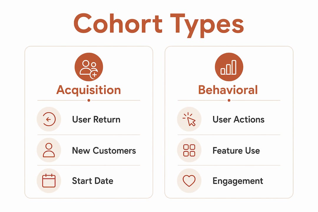
The three primary types are acquisition cohorts, behavioral cohorts, and predictive cohorts. Each one groups users differently and answers a different kind of question.
| Type | How users are grouped | Primary question answered |
|---|---|---|
| Acquisition cohort | By the date or period they first joined or purchased | Are users from a specific period staying? |
| Behavioral cohort | By an action they took (or did not take) | Do certain behaviors predict long-term retention? |
| Predictive cohort | By behavioral trends that forecast future outcomes | Which users are likely to churn or expand? |
Beyond these three, you will also encounter variations based on how the time dimension is structured:
- Time-based cohorts group users by calendar period (weekly, monthly, quarterly) and are the most common starting point.
- Segment-based cohorts group users by a demographic or acquisition attribute, like geography or marketing channel.
- Size-based cohorts group customers by order volume or account size, which is particularly useful for B2B revenue analysis.
Acquisition cohorts measure whether users return, revenue cohorts track how account value changes over time, and behavioral cohorts reveal which early actions predict who stays. Each type surfaces a different layer of the customer lifecycle, and the most thorough analyses often combine two or three of them.
How to run a cohort analysis, step by step
Running a cohort analysis well comes down to asking a precise question before you touch any data. Vague questions produce vague cohorts, and vague cohorts produce charts that look interesting but tell you nothing you can act on.
The process follows six steps:
- Define your business question. “Why are users churning?” is too broad. “At what point in the first 60 days do users acquired through paid search stop returning?” is workable.
- Select your cohort type. Based on your question, choose acquisition, behavioral, or predictive. Most retention questions start with acquisition cohorts.
- Define your key metric. Pick one metric that directly answers your question. For retention, that is usually the percentage of users who return within a defined window.
- Choose your time window. Weekly cohorts work well for fast-moving consumer apps. Monthly cohorts suit SaaS products with longer sales cycles. The window should match how your users naturally engage.
- Build your cohort heatmap. A cohort heatmap is a grid where each row is a cohort (e.g., users who signed up in a given week) and each column is a time period after their start date. The cells show the retention percentage for that cohort at that age. Darker cells mean higher retention.
- Test hypotheses from the patterns. If cohorts from a specific month show a sharp drop at week four, ask what changed that month. A product update? A pricing change? A new onboarding flow?
Cohort tables compare groups by a fixed starting point, not by calendar date, which is what makes them more accurate than a simple time-series chart. Two cohorts both in their “week four” are genuinely comparable, even if one started in january and the other in june.
Pro Tip: Define “active” before you build anything. If your cohort table counts a user as active whenever they log in, you will get inflated retention numbers that mask real disengagement. Tie “active” to a specific, high-value action, like completing a transaction, publishing content, or reaching a core feature, and your cohort data will reflect real usage rather than passive presence.
Worth knowing: Vague definitions of “active” are the most common source of misleading cohort tables. Practitioners consistently recommend aligning the definition with a specific, high-value business action to reduce noise in the data.
Best practices and pitfalls to avoid
Getting cohort analysis right requires more than picking the right chart type. The most common mistakes happen before the analysis even starts.

Define activity precisely. As noted above, a loose definition of “active” corrupts your entire table. This is not a minor calibration issue. If your product has multiple engagement levels, define separate cohorts for each and compare them rather than blending them into one ambiguous metric.
Treat it as a longitudinal study. Cohort analysis works like a longitudinal study, meaning you need to observe the same group over time, not just check in once. A single snapshot of a cohort tells you almost nothing. The value comes from watching how the retention curve flattens, steepens, or shifts across multiple time periods.
Match granularity to your business. High-frequency apps need weekly or daily cohorts to catch early activation and churn patterns. A monthly view would average over the critical first week, hiding exactly the drop-off you need to see. A B2B SaaS product with a 90-day sales cycle, on the other hand, probably does not need daily cohorts.
Do not ignore qualitative data. When a cohort chart shows a sudden cliff, a sharp drop in retention at a specific period, the chart tells you that something happened but not why. Combining cohort charts with session replays or user feedback from those specific users is how you generate hypotheses worth testing.
Common pitfalls to watch for:
- Comparing cohorts of different sizes without normalizing for scale
- Using calendar-time columns instead of cohort-age columns, which makes cohorts incomparable
- Ignoring small cohorts that may have high variance and skew your conclusions
- Treating a single cohort’s behavior as representative of all users
Pro Tip: For e-commerce businesses, weekly cohorts during peak seasons like the holiday period or major sale events will behave very differently from off-peak cohorts. Always label your cohorts with context, not just dates, so you remember what was happening in the business when that group was acquired.
Where cohort analysis gets used in practice
The most instructive cohort analysis examples come from situations where aggregate data was actively misleading someone.
E-commerce retention. A retailer notices that overall repeat purchase rates look healthy. Cohort analysis reveals that customers acquired during a 40%-off promotion have a repeat rate half that of customers acquired at full price. The aggregate number was being propped up by loyal full-price customers, masking the low quality of discount-driven acquisition. Retailers who use cohort analysis to track customer lifecycle behavior can adjust acquisition spend and promotion strategy based on actual long-term value, not just first-purchase volume.
SaaS churn diagnosis. A SaaS company sees that users who activate a specific feature in their first week retain at a dramatically higher rate than those who do not. That single behavioral cohort insight reshapes the entire onboarding flow to push users toward that feature earlier.
Marketing channel comparison. By grouping customers into acquisition cohorts by channel, a growth team discovers that organic search customers have a 12-month retention rate far above that of paid social customers, even though paid social drives more volume. Budget shifts accordingly.
Subscription revenue tracking. Revenue cohorts show that customers on an annual plan expand their accounts at a much higher rate over 18 months than monthly subscribers. The sales team uses this to prioritize annual plan conversion during the trial period.
Product launch evaluation. After a major feature release, a product team creates a behavioral cohort of users who adopted the new feature and compares their 90-day retention against a cohort of non-adopters from the same signup period. The comparison isolates the feature’s actual impact from other variables.
For e-commerce teams specifically, pairing cohort analysis with customer segmentation techniques like RFM (Recency, Frequency, Monetary) analysis gives you both the time-based view and the value-based view of your customer base at once.
What tools support cohort analysis?
The right tool depends on your data volume, technical resources, and how much customization you need.
GA4 (Google Analytics 4) includes a built-in cohort exploration report that works well for website and app behavior. It is free, accessible to non-technical users, and covers basic acquisition cohorts out of the box. The limitations show up when you need to define custom behavioral cohorts or pull in revenue data from outside Google’s ecosystem. For a practical walkthrough of GA4 cohort reports, the setup is straightforward for most e-commerce managers.
Product analytics platforms designed for SaaS and app teams offer deeper behavioral cohort capabilities, including the ability to define cohorts by any combination of events, properties, and time windows. These platforms typically require more setup but give you far more flexibility in how you define and compare cohorts.
Business intelligence tools like Looker, Mode, or Metabase let data teams build custom cohort queries directly against a data warehouse. This approach gives maximum flexibility but requires SQL knowledge and a well-structured data model.
Spreadsheet-based analysis using Google Sheets or Excel works for small datasets and is a good way to understand the mechanics of a cohort table before investing in dedicated tooling. The manual effort does not scale, but the conceptual clarity it builds is worth the exercise.
Specialized e-commerce analytics platforms like Affinsy go beyond standard cohort views by combining transaction-level cohort data with RFM segmentation and market basket analysis. This means you can see not just when customers churn, but what they were buying and which product combinations correlated with higher lifetime value. Affinsy connects via API, CSV upload, or MCP, so you can feed in order data from Shopify, WooCommerce, BigCommerce, Stripe, or any system that exports transactional data. The free tier covers up to 20,000 line items with full feature access and no credit card required.
For teams focused on improving customer retention through data, the tool choice matters less than having a clear analytical question and a consistent definition of the metrics you are tracking.
The real limitations of cohort analysis
Cohort analysis is genuinely useful, but it is not a complete picture on its own. Knowing where it falls short helps you use it more honestly.
Small cohort sizes distort results. A cohort of 15 users will show wild swings in retention percentage from period to period. Those swings are statistical noise, not signal. Before drawing conclusions, check that each cohort has enough users to produce stable percentages.
Correlation is not causation. A behavioral cohort that shows users who watched an onboarding video retain better does not prove the video caused the retention. Users who watch the video may simply be more motivated to begin with. Cohort analysis surfaces patterns; it does not explain them. You need experiments to establish causation.
Data quality problems compound. If your event tracking is inconsistent, if users appear in your system under multiple IDs, or if your “active” definition changed partway through the period you are analyzing, your cohort tables will be wrong in ways that are hard to detect. Garbage in, garbage out applies here more than almost anywhere else in analytics.
Cohort analysis is backward-looking by default. It tells you what happened to a group of users who started at a specific time. It does not tell you what will happen to users starting today, unless you build predictive cohorts using behavioral trend data.
Privacy and data availability constraints are growing. As third-party cookie deprecation continues and privacy regulations tighten, the event-level data that cohort analysis depends on is harder to collect consistently, especially for web-based products that rely on anonymous user tracking.
How to read cohort results and turn them into decisions
Reading a cohort heatmap well is a skill. The numbers in the cells are retention percentages, but the patterns across rows and columns are where the real information lives.
Look for diagonal patterns first. In a well-constructed cohort table, a diagonal pattern where retention drops at the same cohort age across multiple cohorts suggests a product-level issue at that lifecycle stage. If users consistently disengage at week four regardless of when they signed up, something about week four needs attention.
Compare rows to spot acquisition quality differences. If the cohort from march retains at 40% after 90 days and the cohort from april retains at 22%, and those months had different acquisition campaigns, you have a strong signal about campaign quality, not just product performance.
Watch for improving trends over time. If newer cohorts (lower rows in the table) show better retention at equivalent ages than older cohorts, your product improvements are working. This is one of the clearest ways to measure whether a product change actually moved the needle.
Use the plateau as your benchmark. Most retention curves drop steeply early and then flatten. The level at which a cohort’s retention curve flattens is called the retention plateau, and it represents your truly loyal users. Raising that plateau, even by a few percentage points, has a compounding effect on long-term revenue.
Turning observations into decisions requires pairing the cohort data with context. A sharp drop at a specific period combined with a product change that week is a hypothesis worth testing. Pairing cohort charts with qualitative signals like session replays or support ticket themes from that period gives you the “why” that the numbers alone cannot provide.
For e-commerce teams, data-driven retail strategies built on cohort insights tend to outperform campaigns built on aggregate averages, because they target the right customers with the right message at the right lifecycle stage.
Key Takeaways
Cohort analysis turns aggregate user data into time-tracked group behavior, revealing retention, churn, and engagement patterns that flat averages permanently hide.
| Point | Details |
|---|---|
| Core definition | Cohort analysis groups users by a shared characteristic and tracks their behavior over time, not just at a single moment. |
| Aggregate data misleads | Overall retention rates can look healthy while new customer cohorts churn rapidly, a pattern only cohort analysis exposes. |
| Three main types | Acquisition, behavioral, and predictive cohorts each answer a different question about the customer lifecycle. |
| Define “active” precisely | Vague activity definitions are the most common source of misleading cohort tables; tie the metric to a specific high-value action. |
| Match granularity to context | Fast-moving consumer apps need weekly or daily cohorts; monthly views hide critical early activation and churn patterns. |