
TL;DR:
- Effective SaaS churn analysis requires decomposing churn into customer and revenue components, as well as distinguishing voluntary from involuntary causes. Cohort and survival analyses identify when and for whom churn occurs, enabling proactive retention strategies; AI further enhances these efforts by automating risk scoring and sentiment analysis. Combining these insights helps SaaS teams target the right issues, optimize interventions, and improve net revenue retention sustainably.
Most SaaS teams treat churn as a single number. It’s not. Effective SaaS churn analysis means decomposing that number into distinct components, each with its own causes, signals, and remedies. Collapse them into one rate and you end up with strategies that target the wrong problem. This guide walks you through the metrics that actually matter, from customer versus revenue churn and involuntary payment failures to survival analysis and AI-driven risk scoring, so your customer retention analysis produces decisions rather than just reports.
Table of Contents
- Key takeaways
- SaaS churn analysis: customer vs. revenue churn
- Voluntary vs. involuntary churn: why the split matters
- Cohort retention and survival analysis for timing
- AI and predictive churn identification
- My take on where teams get churn analysis wrong
- How Affinsy supports your retention analytics
- FAQ
Key takeaways
| Point | Details |
|---|---|
| Track two churn rates, not one | Measure both customer churn and revenue churn separately to understand who leaves and how much it costs. |
| Separate involuntary from voluntary churn | Payment failures drive 20–40% of SaaS churn and are recoverable with the right dunning logic. |
| Use cohort analysis to find churn cliffs | Retention heatmaps by signup cohort reveal onboarding failures invisible in aggregate rates. |
| Survival analysis improves intervention timing | Time-aware hazard rates tell you when a customer is likely to churn, not just whether they will. |
| AI multiplies CS team capacity | Predictive risk scoring lets smaller teams prioritize high-risk accounts before renewal windows close. |
SaaS churn analysis: customer vs. revenue churn
Before you can reduce churn, you need to know what you’re measuring. The industry distinguishes two core churn rate metrics, and confusing them leads to real strategic errors.
Customer churn (sometimes called logo churn) counts the percentage of customers who cancel in a given period. The formula is straightforward: divide customers lost during the period by customers at the start of the period. Customer and revenue churn are tracked separately because losing 50 customers on $10/month plans is not the same as losing five customers on $1,000/month plans.
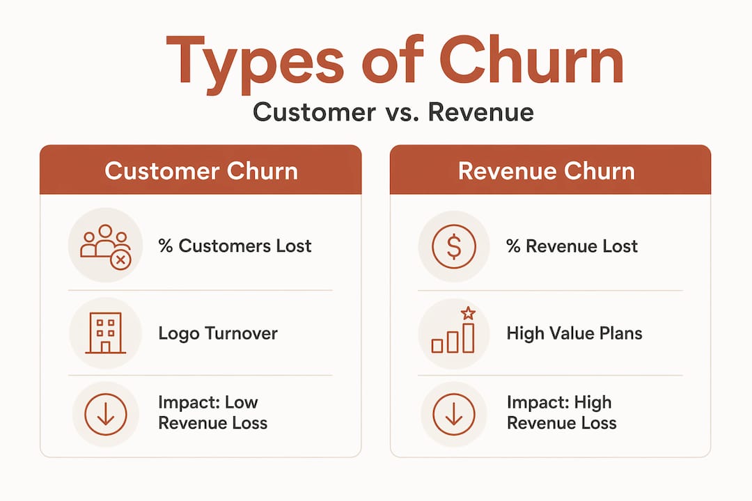
Revenue churn captures exactly that dollar difference. It measures monthly recurring revenue lost to cancellations and downgrades as a percentage of total MRR at the start of the period.
Here’s a concrete example to make the distinction clear:
| Metric | Scenario A | Scenario B |
|---|---|---|
| Customers lost | 100 | 10 |
| Plan type | $10/month (SMB) | $1,000/month (Enterprise) |
| MRR lost | $1,000 | $10,000 |
| Customer churn rate | 5% | 0.5% |
| Revenue churn rate | 0.5% | 5% |
Scenario A looks catastrophic on customer churn but barely moves the revenue needle. Scenario B looks healthy on logo count but destroys your MRR. This is why product and finance teams need both numbers on the same dashboard.
The metric that ties these together is net revenue retention (NRR). NRR above 100% means expansion revenue from upsells and plan upgrades exceeds what you lose to churn and downgrades. That’s the benchmark separating sustainable SaaS growth from a leaky bucket. Tracking your upsell revenue patterns alongside churn gives you the full picture of net retention health.
A few points to keep front of mind when setting up your measurement framework:
- Always use a consistent time window. Monthly churn and annual churn are not interchangeable without conversion.
- Measure at the same point in the billing cycle each period to avoid counting grace-period accounts as retained.
- Segment churn rates by plan tier, acquisition channel, and customer size from day one. Aggregate rates hide the segments actually driving loss.
Voluntary vs. involuntary churn: why the split matters
Once you have clean churn rate metrics, the next cut is separating why customers leave from how the churn is triggered. This distinction is not semantic. Voluntary churn reasons come from cancellation flows, competitive loss, or product dissatisfaction. Involuntary churn has a completely different mechanism: the payment fails, the subscription lapses, and the customer never intended to leave.
| Characteristic | Voluntary churn | Involuntary churn |
|---|---|---|
| Trigger | Customer decision | Billing failure |
| Data source | Cancellation surveys, CRM notes | Payment processor signals |
| Recovery approach | Win-back campaigns, product feedback | Dunning, retry logic, card updates |
| Retention lever | Product, pricing, CS outreach | Operations, billing UX |
| Predictability | Behavioral signals (usage drop) | Card expiry dates, failure codes |
Involuntary churn accounts for 20 to 40% of SaaS subscription churn. That’s a massive portion of your loss that has nothing to do with product satisfaction. Teams that treat all churn as a product problem waste resources on features and price negotiations when the real fix is a better retry schedule.
The good news is that involuntary churn is highly recoverable. Optimized retry logic recovers approximately 71% of failed transactions compared to 53% with standard retry logic. That gap compounds fast when you’re processing thousands of renewals per month.
Pro Tip: Don’t wait for a payment to fail before acting. Pre-dunning emails sent 7 to 14 days before a card expiry date reduce expired-card failures by 35 to 45%. Pair that with in-app notifications, which generate three times higher card update rates than email alone.
A solid involuntary churn mitigation workflow covers these steps:
- Card expiry monitoring: Flag accounts with cards expiring within 30 days and trigger proactive update prompts.
- Intelligent retry scheduling: Space retries across days and times rather than retrying immediately, which rarely succeeds.
- Failure code routing: Different decline codes require different responses. Soft declines retry; hard declines route to a human or alternate payment method prompt.
- Post-failure recovery window: Give customers a clear, frictionless path to update payment details before subscription access is fully suspended.
The larger lesson here is this: failing to distinguish voluntary from involuntary churn doesn’t just misallocate resources. It corrupts your causal analysis entirely, making your churn model blame product problems that don’t exist.
Cohort retention and survival analysis for timing
Aggregate churn rates tell you how much you’re losing. Cohort retention analysis and survival analysis tell you when and to whom. These are the frameworks that transform churn from a lagging indicator into a signal you can act on ahead of time.

Cohort retention analysis groups customers by signup period (week, month, or quarter) and tracks what percentage of each cohort remains active over time. Displayed as a retention heatmap, this format makes problems visible that aggregate numbers hide completely. Retention heatmaps reveal churn cliffs and highlight whether issues are tied to a specific acquisition period, a product change, or an onboarding failure.
A common finding: a product update shipped in Q3 causes Month 2 retention to drop for every cohort acquired after that date. Without cohort segmentation, that signal drowns in the noise of your overall rate.
One critical point on setup: aligning cohort start events to meaningful operational milestones (trial start, paid conversion, first meaningful action) produces far more useful results than using signup date alone. The question you’re asking shapes the cohort definition you need.
Survival analysis takes timing one step further. Instead of asking “did the customer churn?” it models churn as a time-to-event problem: “how long until this customer churns, and how does that probability change over time?” The Cox Proportional Hazards model is the most widely used approach, producing hazard rates that indicate when churn risk spikes for specific customer segments.
Pro Tip: Survival models handle censored data correctly. A customer still active at month 12 is not “didn’t churn.” They contribute partial information about survival time. Standard binary churn models discard this signal. Survival analysis uses it, producing more accurate predictions.
The output of time-aware survival modeling is a “who + when + what” picture of risk. Your CS team gets a prioritized list of accounts by risk window, not just a static probability score. That means outreach lands when customers are actually considering cancellation, not six months too early or a week too late.
Practical applications of cohort and survival analysis for SaaS retention strategies:
- Identify the “Month 3 cliff” common in self-serve products where usage drops if customers don’t reach a value milestone.
- Separate churn risk signals by customer segment to see whether SMB and enterprise customers have different hazard windows.
- Use hazard rate spikes to schedule automated check-in sequences before the high-risk window opens.
AI and predictive churn identification
Cohort analysis and survival models are powerful, but they require analyst time to build and interpret. AI-powered churn risk scoring changes the scale of what’s possible for CS teams operating with limited bandwidth.
Mature customer success teams embed AI into churn risk identification, sentiment analysis, and renewal preparation as core workflows rather than experimental projects. According to Gainsight’s 2026 CS Index, higher AI adoption among advanced CS teams correlates directly with improved accountability for retention outcomes.
The specific capabilities driving results in high-performing CS organizations:
- Automated risk scoring: Models trained on behavioral signals (login frequency, feature usage depth, support ticket volume) produce daily risk scores at the account level without manual analysis.
- Sentiment analysis: Processing support interactions and NPS verbatims surfaces dissatisfaction signals weeks before a formal cancellation request.
- Renewal preparation workflows: AI flags accounts approaching renewal with low health scores, triggering automated outreach sequences calibrated to the account’s specific risk profile.
- Churn reason classification: NLP models categorize cancellation survey responses at scale, turning qualitative feedback into quantifiable trend data.
CS teams using AI show up to 13% higher adoption rates for predictive churn tools with measurable efficiency gains in manual workload. The compounding effect is significant: fewer accounts fall through the cracks, and CS reps spend time on conversations rather than spreadsheet analysis.
The most effective SaaS retention strategies now combine AI risk scoring with survival analysis timing. AI identifies who is at risk. Survival analysis specifies when the risk is highest. Together, they let you run behavioral analytics for churn prevention at a precision and scale that wasn’t practical even three years ago.
For teams building this capability, customer segmentation is the foundation that makes AI churn models work well. Without clean segments, risk models produce noisy scores that don’t separate genuinely at-risk accounts from low-usage accounts that simply have a different engagement pattern.
My take on where teams get churn analysis wrong
I’ve spent years working with subscription data and watching teams make the same analytical errors. The biggest one is not mixing up formulas. It’s skipping the decomposition entirely because “we just want to reduce churn overall.”
That reasoning sounds practical. It’s actually the thing that makes churn reduction efforts stall. When you don’t separate involuntary from voluntary churn, and you don’t break out revenue from customer churn, you end up building retention campaigns for a problem that doesn’t exist while the actual issue (expired cards, broken retry logic) quietly compounds in the billing stack.
The second error I see constantly is teams deploying AI risk scoring before they’ve validated their cohort segmentation. A model trained on bad cohort definitions produces confident but misleading scores. Garbage in, garbage out applies at every level of sophistication.
My honest recommendation: before you touch a predictive model, spend two weeks with a cohort retention heatmap. You will learn more about your actual churn drivers from that one visualization than from six months of qualitative surveys. Once you understand the timing shape of your churn, survival analysis and AI scoring amplify that knowledge rather than replace it.
Churn analysis doesn’t exist in isolation from growth either. The teams I’ve seen do this best treat NRR as the organizing metric that connects churn reduction to expansion strategy. Reducing churn and growing expansion revenue are two sides of the same retention problem, and the data infrastructure you build for one should serve both.
— Mateusz
How Affinsy supports your retention analytics
If your churn analysis has revealed at-risk segments but you’re still guessing at why those segments behave differently, the answer is usually in your transaction and behavioral data. Affinsy analyzes that data to surface the patterns underneath.
Affinsy’s AI-powered customer segmentation uses RFM analysis to automatically group customers by recency, frequency, and monetary value, identifying which segments are drifting toward churn before they cancel. Pair that with market basket analysis to understand which product combinations drive the highest long-term retention, and you have a data-driven foundation for both churn reduction and upsell targeting. You can get started on Affinsy’s permanent free tier with no credit card required, covering up to 20K line items with full product access.
FAQ
What is the difference between customer churn and revenue churn?
Customer churn measures the percentage of subscribers who cancel, while revenue churn measures the percentage of MRR lost to cancellations and downgrades. A business can have low customer churn but high revenue churn if its largest accounts are leaving.
How much SaaS churn is involuntary?
Involuntary churn from payment failures accounts for 20 to 40% of total SaaS subscription churn. Most of it is recoverable with optimized retry logic and pre-dunning outreach.
What is survival analysis in predicting SaaS churn?
Survival analysis models churn as a time-to-event problem, estimating the probability that a customer will churn within a given time window. It outperforms binary churn models by correctly handling customers who are still active at the time of analysis.
How do cohort retention heatmaps help reduce churn?
Cohort retention heatmaps group customers by signup period and display retention over time, making it possible to spot churn cliffs tied to specific product changes or onboarding failures that aggregate churn rates would obscure.
How does AI improve SaaS customer retention analysis?
AI automates risk scoring across your entire customer base, surfaces sentiment signals from support interactions, and triggers outreach workflows before renewal windows close. Teams using AI-driven approaches report measurable gains in retention accountability and reduced manual workload in customer success.
Recommended
- SaaS Upsell Analytics: Grow Revenue from Existing Customers - Affinsy Blog | Affinsy
- Customer Segmentation SaaS: Strategies That Drive Growth - Affinsy Blog | Affinsy
- Churn Rate — E-Commerce Glossary | Affinsy | Affinsy
- Behavioral Analytics: 95% Churn Prediction Boosts Sales - Affinsy Blog | Affinsy