
TL;DR:
- Customer cohort analysis groups customers by a shared starting point and tracks their behavior over time to identify retention issues. It provides detailed retention timelines for groups rather than a single number, helping diagnose why customers stay or leave and measure the impact of product changes. Automating cohort insights and interventions enables retention teams to act swiftly and improve customer loyalty effectively.
Customer cohort analysis groups customers by a shared starting point, then tracks how those groups behave over time, so you can pinpoint the exact windows where retention breaks down and intervene before churn compounds. The output is not a single retention number but a timeline per group that shows which cohorts are improving, which are quietly deteriorating, and what separates the customers who stay from the ones who leave.
Start here: three things to run first:
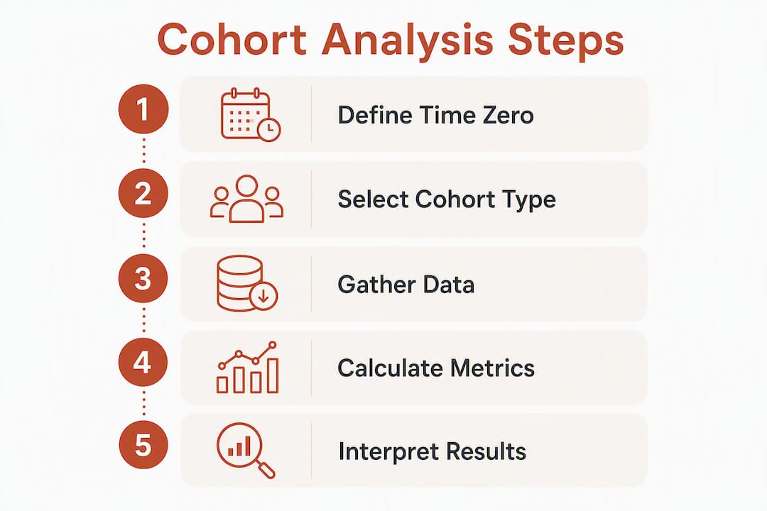
- Define Time Zero. Pick a consistent anchor event for every customer: first purchase date, signup date, or first subscription charge. Without a normalized Time Zero, you are comparing customers at different lifecycle stages and the curves will mislead you.
- Choose your return action. Decide what “retained” means: a repeat purchase, a login, a feature use, a renewal. One metric per analysis.
- Pick your observation windows. Daily for the first week (activation), weekly for the first month, monthly for long-term retention. Match granularity to your product’s natural usage cycle.
First metric to check: Month-1 retention rate. It is the single fastest signal of whether your onboarding is working. A sharp drop between Week 1 and Month 1 tells you where to focus before you look at anything else.
Table of Contents
- What customer cohort analysis actually does for retention and growth
- Which cohort type should you use?
- Key metrics and KPIs to compute across cohorts
- How to build a cohort analysis: Excel, SQL, and BI options
- How to read a cohort table and interpret retention curves
- Turning cohort findings into concrete actions
- Best practices and common mistakes
- Ready-to-use templates and SQL snippets
- How Affinsy operationalizes cohort analysis
- Key Takeaways
- Why cohort analysis is the retention team’s highest-leverage activity in 2026
- Affinsy makes cohort analysis accessible without a data team
- Useful sources and further reading
What customer cohort analysis actually does for retention and growth
Most retention dashboards show a blended average. That number can stay flat while your newest cohorts are quietly getting worse, masked by the strong performance of older, loyal customers. Cohort analysis separates those averages into time-aware narratives, so you can see whether an improvement is real or just an artifact of cohort mix.
The business questions cohort analysis answers that aggregate metrics cannot:
- Did the onboarding change we shipped in March actually improve 30-day retention, or did it just look better because we acquired higher-quality customers that month?
- Which acquisition channel delivers customers who are still purchasing six months later?
- Where in the customer lifecycle does revenue per user start to diverge between segments?
- Is our overall churn rate stable because retention is genuinely healthy, or because a large legacy cohort is propping up the average?
Segmentation vs. cohort analysis: what’s the difference?
The two methods answer different questions. Segmentation gives you a snapshot; cohort analysis gives you a film.

| Dimension | Segmentation | Cohort analysis |
|---|---|---|
| Time dimension | Single point in time | Longitudinal, tracked over multiple periods |
| Core question | Who are my customers right now? | How does a defined group behave over time? |
| Primary output | Audience lists, persona profiles | Retention curves, LTV trajectories |
| Best use case | Targeting, personalization, ad audiences | Diagnosing churn, measuring product changes, proving campaign quality |
| Limitation | Misses behavioral drift over time | Requires consistent event definitions and sufficient sample size |
A cohort is, in effect, a time-bound segment you follow longitudinally. The customer retention metrics that matter most, repeat purchase rate, LTV, and churn, only become meaningful when you can compare them across cohorts over time rather than reading them as a single blended figure.
Which cohort type should you use?
The right cohort type depends entirely on the question you are trying to answer. Building an acquisition cohort when your question is behavioral wastes a sprint. Here are the five main types and when each one earns its place.
-
Acquisition (time-based) cohorts group customers by when they first appeared: the month they made their first purchase, the week they signed up, or the day they installed the app. This is the most common starting point. Use it when you want to know when retention changed. If March cohorts retain worse than February cohorts, something changed at the acquisition or onboarding level between those two months.
-
Behavioral cohorts group customers by actions they took (or skipped) regardless of when they signed up. Did they complete onboarding? Use a specific feature in week one? Make a second purchase within 14 days? Behavioral cohorts answer the question that matters most: why do some customers retain and others do not? They are where cohort analysis gets genuinely diagnostic.
-
Segment-based cohorts group customers by attributes: plan tier, acquisition channel, device type, geography, or company size. Use these when you need to compare retention across business dimensions. Do enterprise customers churn at a different rate than SMB customers? Does one paid channel consistently deliver higher-LTV buyers than another?
-
RFM/monetary cohorts group customers by recency, frequency, and monetary value. An RFM cohort of high-frequency, high-spend customers behaves very differently from a one-time buyer cohort, and treating them identically in retention campaigns is a common and expensive mistake. RFM segmentation is particularly useful for e-commerce teams that want to prioritize retention spend on the customers most likely to respond.
-
Time-window cohorts are built deliberately around an external event or product change, a pricing update, a new onboarding flow, a feature launch. Unlike acquisition cohorts, which group by signup date as a matter of course, time-window cohorts are constructed to measure the before-and-after impact of a specific moment.
Quick rule of thumb: “Did onboarding improve retention?” → acquisition cohort to spot the trend, then layer a behavioral cohort to diagnose why. That combination is the most reliable path from observation to validated intervention.
Key metrics and KPIs to compute across cohorts
Picking the right metric is as important as picking the right cohort type. Here are the core calculations with short formulas.
-
Retention rate (periodic):
(Users active in period N / Users in cohort at Time Zero) × 100. This is the standard cell value in a cohort matrix. Track it at Day 7, Day 30, Day 60, and Day 90 as a minimum. -
Rolling retention:
(Users who were active on day N or later / Cohort size) × 100. Useful for products with irregular usage patterns where a single-day window misses re-engagement. -
Cohort LTV: Sum of revenue generated by a cohort divided by cohort size, measured at fixed intervals (30, 90, 180, 365 days). Compare across acquisition channels to find your highest-quality traffic sources.
-
Average order value (AOV) per cohort:
Total cohort revenue in period / Number of orders in period. Tracks whether a cohort’s spending behavior changes over time. -
Repeat-purchase rate:
(Customers who purchased more than once / Total customers in cohort) × 100. A direct measure of loyalty for e-commerce teams. -
Churn rate:
(Customers lost in period / Customers at start of period) × 100. Compute per cohort, not just in aggregate, to see which groups are driving overall churn.
Observation windows by business model:
| Business model | Recommended windows |
|---|---|
| E-commerce (low frequency) | Day 30, Day 60, Day 90, Day 180, Day 365 |
| SaaS / subscription | Day 7, Day 30, Day 60, Day 90, Day 180 |
| Mobile / high-frequency app | Day 1, Day 7, Day 14, Day 30 |
On sample size: a cohort of 30–50 users produces volatile rates that look like patterns but are not statistically reliable. If a behavioral cohort is that small, broaden the time window or loosen the action definition before treating the result as a signal.
How to build a cohort analysis: Excel, SQL, and BI options
Data checklist
Before you build anything, confirm you have these fields in a clean, consistent format:
- Customer ID — a single, stable identifier per person across all touchpoints
- Event timestamp — in UTC; normalize time zones before analysis or your cohort boundaries will shift
- Event type — purchase, signup, login, feature use; define each consistently across systems
- Transaction ID — for deduplication; duplicate events inflate retention rates
- Revenue — for LTV and AOV calculations
Data quality and consistent event definitions are non-negotiable. If events are tracked differently across platforms or time zones, cohort results are unreliable from the start.
Cadence guidance
Match granularity to your product’s natural usage cycle. Daily cohorts make sense for the first week when activation happens fast. Weekly cohorts work for the first month. Monthly cohorts are appropriate for long-term retention analysis, though they can mask changes that shipped mid-month.

Three build recipes
1. Excel pivot approach
- Export your orders table with Customer ID, Order Date, and Revenue.
- Add a “Cohort Month” column:
=TEXT(MIN(IF(A:A=A2,B:B)),"YYYY-MM")(array formula, Ctrl+Shift+Enter). - Add a “Period Number” column:
=DATEDIF(cohort_month_start, order_date, "M"). - Build a pivot table: rows = Cohort Month, columns = Period Number, values = Count Distinct Customer ID.
- Divide each cell by the cohort’s Period-0 count to get retention percentages.
- Apply a conditional color scale (green-to-red) to create a visual heatmap.
2. SQL pseudocode
-- Step 1: Assign each customer their Time Zero (first purchase month)
WITH cohort_base AS (
  SELECT
    customer_id,
    DATE_TRUNC('month', MIN(order_date)) AS cohort_month
  FROM orders
  GROUP BY customer_id
),

-- Step 2: Join back to all orders and compute period offset
cohort_activity AS (
  SELECT
    cb.cohort_month,
    cb.customer_id,
    DATE_DIFF('month', cb.cohort_month, DATE_TRUNC('month', o.order_date)) AS period_number
  FROM cohort_base cb
  JOIN orders o ON cb.customer_id = o.customer_id
),

-- Step 3: Count distinct active customers per cohort per period
cohort_size AS (
  SELECT cohort_month, COUNT(DISTINCT customer_id) AS total_customers
  FROM cohort_base
  GROUP BY cohort_month
)

-- Step 4: Compute retention rate
SELECT
  ca.cohort_month,
  ca.period_number,
  COUNT(DISTINCT ca.customer_id) AS active_customers,
  cs.total_customers,
  ROUND(COUNT(DISTINCT ca.customer_id) * 100.0 / cs.total_customers, 1) AS retention_pct
FROM cohort_activity ca
JOIN cohort_size cs ON ca.cohort_month = cs.cohort_month
GROUP BY ca.cohort_month, ca.period_number, cs.total_customers
ORDER BY ca.cohort_month, ca.period_number;
3. BI/tool checklist
When using a BI platform or a dedicated analytics tool, verify these before trusting the output:
- Identity resolution is set to user-level, not device-level
- Time Zone is normalized to a single standard (UTC recommended)
- “Return action” definition matches your SQL/Excel definition exactly
- Data retention window covers at least 12 months for meaningful long-term curves
- Cohort definitions are saved and versioned so you can rerun them consistently
Pro Tip: Save your cohort definitions as named segments in your BI tool or as a saved SQL view. When you automate cohort updates, those saved definitions become the triggers for signal-based interventions, so naming and versioning them from the start saves significant rework later.
How to read a cohort table and interpret retention curves
A cohort retention matrix is a triangular grid. Rows are cohorts (grouped by their Time Zero period). Columns are time intervals since that start. Each cell shows the percentage of that cohort still active in that period. Newer cohorts have empty later columns because they have not lived long enough to fill them yet.
Here is a sample retention matrix for an e-commerce brand tracking repeat purchases:
| Cohort | Month 0 | Month 1 | Month 2 | Month 3 | Month 4 | Month 5 |
|---|---|---|---|---|---|---|
| Jan | 100% | 28% | 18% | 14% | 12% | 11% |
| Feb | 100% | 28% | 11% | — | 11% | — |
| Mar | 100% | 34% | — | 11% | — | — |
| Apr | 100% | 34% | — | — | — | — |
| May | 100% | 38% | — | — | — | — |
How to read it: The January cohort started at 100% and retained 28% of customers in Month 1. By Month 5, only 11% were still purchasing. The April and May cohorts show notably higher Month-1 retention (34% and 38%), which suggests something changed in acquisition quality or onboarding around that time.
Three retention-curve shapes and what they mean:
-
Steady decay (Jan/Feb pattern above): Normal for e-commerce. The curve drops steeply in Month 1, then flattens. The floor it settles at is your loyal customer base. Focus on raising Month-1 retention, since that is where the biggest volume of customers is lost.
-
Kinked drop at a specific period: A sudden steeper drop at Month 3 or Month 6 often signals a contract renewal point, a pricing change, or a product experience failure at a specific lifecycle stage. Cross-reference that period with product releases and pricing changes.
-
Improving cohorts (Apr/May above): Month-1 retention climbing across consecutive cohorts is a strong signal that an onboarding or acquisition change is working. Annotate the chart with the date of that change to confirm causality.
Annotating for context: Add vertical markers or row annotations for product launches, campaign start dates, and pricing changes. A cohort that looks like an outlier often makes complete sense once you see it was acquired during a promotional period or experienced a new onboarding flow.
When a cohort shows an unusual spike or dip, cross-reference acquisition source, product version, and onboarding flow for that cohort immediately. The anomaly is almost always explained by one of those three factors.
Turning cohort findings into concrete actions
A cohort report that sits in a dashboard without triggering a response is wasted work. The highest-impact practice is mapping each cohort signal to a specific treatment and automating that treatment where possible.
Signal-to-treatment mapping framework:
| Cohort signal | Hypothesis | Experiment | Treatment |
|---|---|---|---|
| Month-1 retention below benchmark | Onboarding is not driving the activation behavior | A/B test new onboarding email sequence vs. control | Triggered Day-3 and Day-7 emails with specific next-step prompts |
| High-value cohort showing early churn | Pricing or feature gap at Month 3 | Survey + hold-out test of proactive outreach | Sales or CS outreach at Day 60 for at-risk high-LTV customers |
| Behavioral cohort (feature adopters) retains 2x better | Feature adoption is the activation milestone | Push non-adopters toward feature in onboarding | In-product nudge at Day 5 for users who have not triggered the feature |
| Acquisition channel cohort underperforms on LTV | Channel attracts low-intent buyers | Pause spend, shift budget, measure next cohort | Reallocate acquisition budget; adjust channel targeting |
Experiment design checklist:
- State a single metric to move (e.g., Day-30 retention rate for the March acquisition cohort).
- Define acceptance criteria before you start (e.g., a 3-percentage-point lift in Month-1 retention).
- Run the experiment long enough to see the metric you care about. A Day-30 retention experiment needs at least 30 days of observation after the last customer enters the test.
- Keep cohort definitions consistent between the experiment and the control group.
Automation playbook for signal-based cohorts:
- Immediate trigger: Customer completes purchase but does not return within 14 days → enters a re-engagement email sequence automatically.
- Email flows: Retention email campaigns tied to cohort membership (e.g., “first-purchase cohort, no second purchase by Day 21”) rather than generic broadcast sends.
- In-product nudges: Users in a behavioral cohort that has not adopted a key feature receive a contextual prompt at their next login.
- Sales outreach: High-LTV cohort members who show early churn signals (declining order frequency) get flagged for a personal outreach from an account manager.
Pro Tip: Build your automation triggers around cohort membership updates, not one-time list exports. When a customer’s behavior changes and they move into a new cohort, the treatment should fire automatically. Static list exports go stale within days.
Best practices and common mistakes
Do/don’t checklist for cohort hygiene:
- Do normalize Time Zero for every customer before any calculation. Without it, you are comparing customers at different lifecycle stages and the curves will mislead you.
- Do use a single, stable customer identifier across all data sources. Merging web, mobile, and in-store data under one ID is identity resolution, and it is what separates a reliable cohort from a noisy one.
- Do define your return action once and apply it consistently. Changing the definition mid-analysis invalidates comparisons.
- Don’t read statistical signal from cohorts with fewer than 50–100 users. Broaden the time window or loosen the action definition first.
- Don’t mix customers acquired before and after a major product change in the same cohort window. Split them into separate cohorts to isolate the effect.
- Don’t build only acquisition cohorts. They tell you when retention changed; they cannot tell you why. Layer behavioral cohorts to diagnose the cause.
Common anti-patterns:
- Oversegmentation: Splitting cohorts into too many small groups produces dozens of noisy curves that contradict each other. Start broad, then drill down only when a pattern is clear.
- Monthly cohorts masking mid-month changes: If a product change shipped on March 15, a monthly cohort blends two weeks of pre-change behavior with two weeks of post-change behavior. Use weekly cohorts to isolate the effect.
- Cohort leakage: Customers who meet the cohort definition after the window closes are accidentally included. Lock cohort membership at the end of the definition period.
Quick troubleshooting guide:
- Retention looks volatile week over week → check cohort size first. Small N is almost always the cause.
- Two cohorts with identical acquisition sources show very different curves → check time zone normalization and event deduplication.
- Month-1 retention suddenly jumps → check for a promotional event that inflated first purchases without genuine engagement.
Ready-to-use templates and SQL snippets
Annotated SQL for acquisition cohorts
The pseudocode in the build section above covers the full retention calculation. Two additional notes for production use:
- Time Zero normalization: Always use
DATE_TRUNC(or your SQL dialect’s equivalent) to snap timestamps to the start of the period. Raw timestamps produce fractional periods that break cohort boundaries. - Deduplication: Add
WHERE order_id NOT IN (SELECT order_id FROM duplicate_orders)before the cohort base CTE, or use aROW_NUMBER()partition to keep only the first event per customer per day.
Excel formulas
For teams working in spreadsheets, the core formulas are:
- Cohort month assignment:
=TEXT(MINIFS(order_date_col, customer_id_col, [@customer_id]), "YYYY-MM") - Period number:
=DATEDIF(DATE(LEFT(cohort_month,4), MID(cohort_month,6,2), 1), order_date, "M") - Retention cell: In the pivot, divide each period count by the Period-0 count for that row:
=B3/B$3(where B3 is the active count and B$3 is the cohort size). - Heatmap: Select the retention percentage range → Conditional Formatting → Color Scale (green high, red low).
Loading a template into a BI tool or Affinsy
To get from a spreadsheet template to a working cohort report quickly:
- Export your orders as a CSV with at minimum:
customer_id,order_date,order_id,revenue. - Add the
cohort_monthandperiod_numbercolumns using the formulas above, or let the tool calculate them on import. - Upload the CSV to your BI tool or to Affinsy via the CSV upload flow.
- In Affinsy, the platform computes RFM segments and cohort groupings automatically from the transaction data, so you can move from raw export to first insight without writing SQL.
How Affinsy operationalizes cohort analysis
A mid-size e-commerce brand selling home goods was seeing stable blended retention but could not explain why revenue per customer was declining quarter over quarter. The team exported 18 months of order data as a CSV and loaded it into Affinsy. The RFM segmentation immediately surfaced that their highest-frequency buyers from the prior year had shifted into a lower-frequency tier, a pattern invisible in the aggregate numbers. Acquisition cohort analysis confirmed the shift started with a cohort acquired during a heavy discount promotion eight months earlier. Those customers had high initial purchase rates but low repeat rates and low AOV on subsequent orders. The treatment: a separate email sequence for that cohort focused on full-price product discovery, plus a change to acquisition targeting that deprioritized deep-discount traffic. Month-1 retention for the next two cohorts improved measurably.
Practical workflow with Affinsy:
- Export order data from Shopify, WooCommerce, BigCommerce, Stripe, or any platform that produces transactional data.
- Upload via CSV or connect via API. No direct warehouse integration is required.
- Affinsy computes RFM segments, market basket associations, and cohort groupings automatically.
- Export named segments directly to Klaviyo, MailerLite, or Omnisend for activation.
- Save cohort definitions for recurring reports and signal-based triggers.
Onboarding checklist for teams starting with Affinsy:
- Confirm your order export includes
customer_id,order_date,order_id, andrevenueat minimum. - Clean for duplicates and normalize timestamps to UTC before upload.
- Start with the free tier (up to 20K line items, no credit card required) to validate the data format and review initial RFM output.
- Review the automated hypotheses ranking to identify which cohort signals Affinsy flags as highest priority.
- Export the first segment to your email tool and run a single treatment experiment before scaling.
Most teams reach their first cohort insight within a few hours of a clean CSV upload.
Key Takeaways
Customer cohort analysis is only as useful as the treatments it triggers: define Time Zero consistently, measure the right metric per business question, and automate responses to cohort signals to turn analysis into retention gains.
| Point | Details |
|---|---|
| Normalize Time Zero first | Every customer needs a consistent anchor event before cohort comparisons are valid. |
| Match cohort type to your question | Acquisition cohorts show when retention changed; behavioral cohorts explain why. |
| Watch Month-1 retention | It is the fastest signal of onboarding health and the period with the highest churn volume. |
| Minimum sample size matters | Cohorts under 50–100 users produce volatile rates; broaden windows before drawing conclusions. |
| Affinsy for e-commerce cohorts | Upload a CSV export, get RFM segments and cohort groupings automatically, then push segments to Klaviyo, MailerLite, or Omnisend. |
Why cohort analysis is the retention team’s highest-leverage activity in 2026
The conventional wisdom treats cohort analysis as a reporting exercise: run the matrix monthly, share it in a slide, move on. That framing undersells it badly.
The teams getting the most out of cohort analysis in 2026 are not running batch reports. They are building cohort membership as a live signal that feeds directly into automated workflows. When a customer’s behavior places them in a “likely to churn” cohort, a treatment fires within hours, not at the next monthly review. That shift from periodic reporting to signal-based intervention is where the real retention leverage lives.
There is also a subtler point worth making: most teams over-invest in acquisition cohort analysis and under-invest in behavioral cohorts. Acquisition cohorts are easier to build and easier to explain in a board deck. But they only tell you when something changed. The behavioral layer, grouping customers by what they actually did in their first 7 or 14 days, is what tells you why and gives you something specific to change. The combination of both is what separates teams that observe churn from teams that reduce it.
One more thing: cohort analysis is not a tool for proving your instincts right. The most valuable findings are usually the ones that contradict what you expected. A channel that looks expensive on a cost-per-acquisition basis might deliver cohorts that retain at twice the rate of your cheapest channel. You will not see that in a CAC report. You will only see it in a cohort view.
Affinsy makes cohort analysis accessible without a data team
If you have been running cohort analysis manually in spreadsheets or waiting on engineering to pull SQL, Affinsy offers a faster path. Upload your order export as a CSV, and the platform automatically computes RFM customer segments, product associations, and cohort groupings from your transaction history. No SQL required, no warehouse setup, no data science skills needed.
The free tier covers up to 20K line items with full product access and no credit card required, which is enough to validate your data format and get your first retention insight the same day. Pro ($49/mo) and Max ($199/mo) plans unlock larger datasets and API access for teams that want to automate cohort updates as a live signal feed. When you are ready to push segments to your email platform, Affinsy exports directly to Klaviyo, MailerLite, and Omnisend so the treatment follows the insight without a manual handoff.
Start with your last 12 months of order data, run the customer segmentation report and see which cohorts are worth prioritizing before you build a single email flow.
Useful sources and further reading
A short note for US-based teams: when exporting customer data for cohort analysis, check your data residency obligations under applicable state privacy laws (CCPA in California, and similar statutes in other states). Customer-level transaction data used for segmentation and behavioral analysis typically falls within the scope of these regulations. Confirm with your legal team before sending customer IDs and behavioral data to third-party analytics platforms.
Authoritative sources used in this article:
- Cohort Retention Analysis for Small Businesses: Tips + FAQ (2026) — Shopify’s practical guide covering granularity, sample size, and data quality for retail cohort analysis.
- Cohort analysis for businesses: Here’s what to know — Stripe’s overview of cohort types, metric selection, and the value of layering acquisition and behavioral cohorts.
- Cohort analysis for SaaS: types, how-to guide, and examples — Appcues’ breakdown of cohort categories and the cohort matrix structure, with SaaS-specific examples.
- Cohort analysis — Wikipedia’s reference entry on the method, useful for definitional grounding.
- Customer cohorts: Drive smarter growth with data insights — Affinsy’s guide to mapping cohort insights to retention playbooks and growth strategies.
- Understanding Customer Retention: A 2026 Guide for E-Commerce — Affinsy’s retention primer covering 2026 best practices for e-commerce teams.