
TL;DR:
- Feature adoption focuses on users repeatedly and meaningfully using a feature within their workflow, unlike simple usage metrics. Analyzing adoption through funnel stages, segmentation, and velocity reveals actionable insights to improve retention and product growth. Accurate measurement requires defining clear events, targeting eligible users, and interpreting data at the cohort level to drive strategic decisions.
Most product teams track feature usage and call it a day. The problem is that usage and adoption are fundamentally different: a user clicking a button once is not the same as that user integrating the feature into their regular workflow. Feature adoption analysis, known more formally in product analytics as adoption funnel measurement, gives you a structured way to tell the difference and act on what you find. If you manage products in e-commerce or SaaS, this distinction is where retention is won or lost.
Table of Contents
- Key takeaways
- What feature adoption analysis actually measures
- Diagnosing with the feature adoption funnel
- Measuring adoption velocity
- Connecting adoption to retention and revenue
- Practical tips and mistakes to avoid
- My honest take on where adoption analysis goes wrong
- How Affinsy helps you act on adoption data
- FAQ
Key takeaways
| Point | Details |
|---|---|
| Usage does not equal adoption | Repeated, value-driven use is the true measure of adoption, not one-time interactions. |
| Eligible users are the right denominator | Always scope your adoption metrics to users who actually have access to the feature. |
| Funnel stage diagnosis matters | Knowing where users drop off determines whether you fix discoverability, friction, or perceived value. |
| Velocity predicts retention | Features that reach a 20% adoption threshold fast correlate strongly with long-term user retention. |
| Segments reveal what aggregates hide | A 12% overall rate can mask 60% adoption among your best-fit customers and 3% everywhere else. |
What feature adoption analysis actually measures
The phrase “feature adoption” gets used loosely, so start with a precise definition before touching any data. Feature adoption means a user has moved from first exposure to repeated, value-driven use of a feature as part of their regular workflow. Misdiagnosing usage as adoption leads to confident product decisions built on the wrong signal.
The core metrics stack for any adoption rate assessment has four layers:
- Try rate (breadth): The share of eligible users who attempt the feature at least once within a set window. A try rate above 20% is your baseline for a feature worth monitoring.
- Activation rate (depth initiation): Users who reach a meaningful milestone during that first use, not just a click but a completed action that signals value.
- Stickiness (depth over time): The ratio of daily active users to monthly active users within the feature. A try rate above 40% paired with 80% stickiness indicates genuine adoption. A try rate of 20% with stickiness below 35% is shelfware.
- Cohort retention curve (business impact): How the retention rate of feature adopters compares to non-adopters over 30, 60, and 90 days.
One often overlooked calculation error is the denominator problem. If a feature is only available on your Pro plan, dividing by total users produces a misleading low number. Use eligible users as your denominator so your adoption rate actually reflects the population that could have adopted. Staged rollouts make this even more critical: mix cohorts from different access dates and your velocity numbers become noise.
Pro Tip: Separate your try rate from your return rate in the first 30 days. If try rate is healthy but return rate is low, you have a shelfware problem, not a discoverability problem. These two diagnoses need completely different fixes.
Diagnosing with the feature adoption funnel
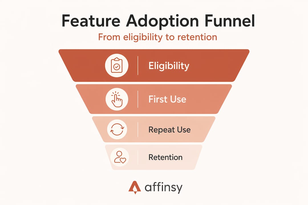
Once you have your metrics defined, the next step in any product feature analysis is mapping where users actually fall out of the adoption journey. The funnel has six stages, and each one has a distinct failure mode.
- Eligibility: Is the feature accessible to this user based on their plan, role, or region? Check here before blaming anything else.
- Awareness: Does the user know the feature exists? Low awareness shows up as near-zero try rates even among eligible users.
- First trial: Did the user interact with the feature at all? If awareness is adequate but trial is low, UX friction or intimidating setup is likely the culprit.
- Activation: Did the user complete a meaningful action? This is where value misalignment vs. discoverability problems become visible. One needs a redesigned flow; the other needs better onboarding.
- Retention: Does the user return to the feature within the next 30 days? If activation is fine but retention collapses, the feature is not delivering on its promise in real use.
- Habit formation: Is the feature embedded in the user’s regular workflow? This is the stage that links directly to long-term retention and expansion revenue.
Segmenting adoption by plan, industry, and persona reveals adoption gaps that aggregate numbers bury completely. You might see 15% overall adoption and conclude a feature is underperforming. Break that down by plan tier and you might find enterprise accounts at 72% while free-tier users sit at 4%. These are two entirely different problems requiring two entirely different responses.
Cohort analysis adds the time dimension. Group users by the week they first gained access, then track each cohort through the funnel separately. This surfaces whether a change you made to onboarding three weeks ago actually moved the needle or whether you are still looking at a cohort that predates the fix.
Measuring adoption velocity
Adoption velocity answers a question that a static adoption rate cannot: how fast is the feature spreading? The formula is straightforward. Measure the number of days from initial rollout to the point where a defined percentage of eligible users have completed their first meaningful use. Typically that threshold is set at 20%.

The business implications are significant. Features reaching 20% adoption within 10 days showed 3.2x higher retention than features that took longer to reach the same threshold. Speed of uptake is a leading indicator of long-term success, not just a vanity launch metric.
Here is what velocity data tells you in practice:
- Fast velocity with low final rate: The early adopters found value quickly, but the feature is not spreading to the broader base. Check in-app discoverability and cross-segment targeting.
- Slow velocity with high final rate: The feature eventually works but has a steep learning curve or poor initial positioning. Onboarding changes can compress the time to value.
- Slow velocity and low rate: This is the clearest signal that something is fundamentally wrong. Either the feature does not resonate or it is nearly impossible to find.
Correct instrumentation is required to get velocity right. You need to capture the eligibility event, the first-use event, and the activation event as separate timestamped records, linked to a user ID. Without that, you are measuring app-wide activity windows rather than feature-specific adoption curves. Running per-cohort adoption curve monitoring tied to feature flag access dates also enables early alerts on anomalies before a slow rollout hardens into a failed launch.
Pro Tip: Do not measure velocity against your launch announcement date. Measure it from the date each individual user first gained access. This distinction matters enormously in staged rollouts where access windows span weeks.
Connecting adoption to retention and revenue
Here is where feature utilization tracking pays off in dollars and not just dashboards. The most persuasive analysis you can run for any product stakeholder is a cohort retention comparison: users who adopted a feature vs. users who did not.
| User group | 90-day retention | Notes |
|---|---|---|
| Adopted 1 feature | ~40-50% | Moderate improvement over baseline |
| Adopted 3+ features | 2-3x baseline retention | Strongest retention predictor at the feature level |
| No feature adoption | Baseline | Control group for comparison |
The multi-feature adoption finding is particularly important for SaaS and e-commerce subscription products. A user who adopts three or more features is not three times more valuable than a user who adopts one. They are exponentially more embedded. Every additional feature that becomes part of their workflow raises the cost of switching to a competitor. Analytics applied to retention in direct-to-consumer and SaaS contexts consistently confirms this relationship.
Aggregate metrics like DAU/MAU obscure this. A healthy DAU/MAU ratio tells you that users are logging in. It does not tell you what they are doing, whether that activity is deepening or narrowing, or which features are generating the engagement that prevents churn.
The right way to prioritize feature development is by retention lift per cohort, not by overall usage volume. A feature used by 5% of your users that retains them at 3x the baseline rate deserves more investment than a feature used by 60% of users with no measurable retention effect.
Connecting user engagement insights to churn models requires this kind of feature-level cohort data. Without it, you are guessing at which product investments actually protect revenue.
Practical tips and mistakes to avoid
Operationalizing feature adoption analysis well comes down to a handful of disciplines that most teams skip in the name of speed.
The biggest single mistake is instrumenting at the page or component level and treating any interaction as an adoption signal. Clicks and pageviews alone do not reliably indicate adoption. You need event schemas that distinguish the eligibility event, the first meaningful action, the activation milestone, and recurring use within a defined window. Define these before you build, not after.
A few other practices that separate rigorous teams from the rest:
- Segment every report by plan, persona, and tenure. A 12% aggregate adoption rate can hide 60% adoption in your ideal customer profile and 3% everywhere else. The aggregate number is nearly useless for making decisions.
- Connect telemetry to adoption data. Unexpected adoption dips are not always UX problems. Correlating adoption data with system telemetry like latency and error rates via unified tracing lets you distinguish a UX failure from a technical one before you send your design team down a dead end.
- Tie every adoption report to a time-bounded cohort. Cumulative adoption rates reported without a cohort boundary become harder to interpret with every passing week. Lock each analysis to a defined access period.
- Access behavioral data on demand. Analyst bottlenecks in pulling adoption reports delay decisions by days or weeks, often long enough for a fixable problem to become a launch postmortem.
Pro Tip: When you use analytics platforms with built-in filtering by user, feature, and time window, like the approach described in Microsoft Fabric’s adoption reports, you cut the time from question to insight significantly. The same filtering logic applies to any well-instrumented SaaS product.
My honest take on where adoption analysis goes wrong
I have seen a lot of product teams run adoption reports, celebrate a rising try rate, and then wonder why churn is not improving. In my experience, the confusion almost always comes from the same place: teams treat adoption analysis as a reporting exercise instead of a diagnostic one.
What I mean is that most teams stop at the rate. They set up a dashboard that shows 30% adoption and move on. What they miss is the funnel beneath the rate. Is that 30% uniformly distributed across plan tiers? Is it driven by a single persona who happened to get a good onboarding demo? Does it drop to 8% in the second month? These questions are where the real work is, and they rarely get asked because the dashboard number looked fine.
The velocity metric is where I have found the most underused leverage. In my experience, when a feature takes more than 15 days to reach even 10% adoption in a well-positioned rollout, the team almost never circles back to investigate why. They attribute it to the feature being “advanced” or “for power users” and move on. But slow velocity is often a solvable onboarding problem, not a product fit problem.
The deeper issue is organizational. Adoption analysis only becomes a growth engine when the product, data, and marketing teams share the same funnel definitions and the same denominators. When each team measures adoption differently, the resulting disagreements are not about the product. They are about whose spreadsheet is right.
My recommendation is to start with the funnel, not the dashboard. Define each stage, agree on eligible users as the denominator, and run your first cohort comparison against retention before you build any new features at all. The results will tell you exactly where to invest.
— Mateusz
How Affinsy helps you act on adoption data
Running rigorous feature adoption analysis generates a lot of questions about which users are sticking, which segments are thriving, and which product behaviors actually drive repeat purchases or renewals. Affinsy is built to answer exactly these questions for e-commerce and SaaS teams. Its AI-powered analytics surfaces hidden patterns in your transaction and behavioral data through market basket analysis and customer segmentation, giving you the segment-level clarity that aggregate adoption dashboards miss.
You can connect your data through API, CSV upload, or MCP. No data science skills required. Affinsy’s free tier handles up to 20,000 line items with full platform access and no credit card needed, so you can run your first cohort analysis today without a procurement conversation.
FAQ
What is feature adoption analysis?
Feature adoption analysis is the process of measuring how many eligible users move from first exposure to repeated, value-driven use of a product feature. It uses metrics like try rate, activation rate, stickiness, and cohort retention to diagnose adoption health across funnel stages.
How is feature adoption different from feature usage?
Usage counts any interaction with a feature, including one-time clicks. Adoption requires sustained, repeated use that integrates the feature into a user’s workflow. Treating usage as adoption produces misleading product decisions.
What is a good feature adoption rate?
A try rate above 40% combined with 30-day stickiness above 80% is a strong adoption signal. A try rate above 20% with stickiness below 35% typically indicates shelfware, where users try the feature once and never return.
Why do adoption rates look different across user segments?
Aggregate adoption rates mask significant variability. A 12% overall rate can reflect 60% adoption among your ideal customer profile and 3% everywhere else. Segmenting by plan, persona, and tenure is required before drawing any conclusions.
How does feature adoption affect customer retention?
Users who adopt three or more features retain at two to three times the rate of users who adopt none. Cohort retention curves comparing adopters to non-adopters are the clearest way to quantify this impact and justify feature investment.
Recommended
- Customer Segmentation SaaS: Strategies That Drive Growth - Affinsy Blog | Affinsy
- SaaS Upsell Analytics: Grow Revenue from Existing Customers - Affinsy Blog | Affinsy
- Data-driven sales optimization guide for e-commerce - Affinsy Blog | Affinsy
- Boost sales with data-driven product recommendations - Affinsy Blog | Affinsy